How to Build a Landing Page with Elementor
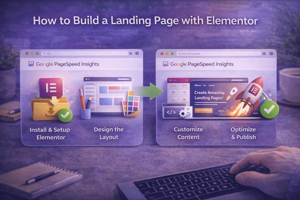
This complete Elementor landing page tutorial walks you through every step of building a high-converting landing page from scratch — no coding required. If you have been looking for a practical, structured Elementor landing page tutorial that covers not just the technical steps but the conversion strategy behind each section, this guide is built for you. Elementor is the most widely used page builder in the WordPress ecosystem, and landing pages are one of its most powerful use cases — but only when you build them with the right structure.
Following this Elementor landing page tutorial, you will learn how to set up a distraction-free canvas, build a high-impact hero section, structure your benefits and social proof sections, add a lead capture form, and publish a page that is optimized for both speed and conversions. Each section of this Elementor landing page tutorial is designed to be actionable — you can open Elementor alongside this guide and build as you read.
By the end of this Elementor landing page tutorial, you will have a complete, professionally structured landing page ready to capture leads, promote an offer, or drive sales — built entirely in Elementor without writing a single line of code.
Table of Contents
- What Is an Elementor Landing Page and Why It Matters
- Step 1: Set Up Your Page and Choose the Right Template Approach
- Step 2: Configure a Distraction-Free Canvas
- Step 3: Build a High-Converting Hero Section
- Step 4: Add a Benefits Section That Persuades
- Step 5: Build a Social Proof Section
- Step 6: Add a Lead Capture Form or CTA Section
- Step 7: Handle Objections with a FAQ Section
- Step 8: Optimize for Speed and Mobile
- Step 9: Publish, Test, and Set Up Conversion Tracking
- Common Elementor Landing Page Mistakes to Avoid
- Elementor Landing Page Tutorial Checklist
- Frequently Asked Questions
What Is an Elementor Landing Page and Why It Matters
Before diving into the technical steps of this Elementor landing page tutorial, it is worth understanding what separates a landing page from a regular website page — because that distinction drives every design and structural decision you make in Elementor.
A landing page has one job: to get a visitor to take one specific action. That action might be submitting a lead form, clicking a buy button, registering for a webinar, or downloading a free resource. Everything on the page — the headline, the copy, the imagery, the button placement, the section order — exists to move the visitor toward that single conversion goal. Unlike a regular website page that invites exploration, a well-built Elementor landing page removes every distraction and alternative exit that might prevent a conversion.
This principle has direct consequences for how you build in Elementor. An effective Elementor landing page tutorial result removes global site navigation (which gives visitors escape routes before they convert), uses a single prominent call-to-action repeated at multiple points, follows a proven section sequence — Hook → Problem → Solution → Benefits → Proof → CTA — and is built with mobile visitors as the primary audience, since the majority of landing page traffic arrives on phones.
The reason this Elementor landing page tutorial matters in 2026 is that Elementor has evolved into one of the most fully featured landing page tools available in WordPress. With Elementor Pro, you can build every element a high-converting landing page needs — hero, form, testimonials, FAQ accordion, popup — without installing a single additional plugin.
The most common mistake builders make when following an Elementor landing page tutorial is optimizing for visual design before conversion structure. A beautifully designed page with the wrong structure will always underperform a plain page with the right structure. Build the structure first — then make it look good.
| Landing Page Section | Conversion Role | Elementor Widget |
|---|---|---|
| Hero (above fold) | Hook attention, communicate value proposition | Heading, Text, Button, Background Image |
| Problem / Pain | Create identification and urgency | Heading, Text Editor, Icon List |
| Benefits | Explain what the visitor gains | Icon Box, Image Box, Columns |
| Social Proof | Build trust and reduce perceived risk | Testimonial, Star Rating, Counter |
| Lead Capture / CTA | Drive the conversion action | Form (Pro), Button, Heading |
| FAQ | Handle objections before they kill conversions | Toggle, Accordion |
| Final CTA | Re-engage scrollers who passed the first CTA | Button, Heading, Colored Section |
Step 1: Set Up Your Page and Choose the Right Template Approach
The first step in this Elementor landing page tutorial is creating the WordPress page and making foundational setup decisions before you open the Elementor editor. Skipping these steps leads to styling conflicts, structural problems, and extra rework later.
What You Need Before You Start
Elementor Free or Elementor Pro — The core layout and design capabilities used throughout this Elementor landing page tutorial are available in Elementor Free. However, Elementor Pro is strongly recommended for any lead generation landing page because it includes the Form widget with native email marketing integrations (Mailchimp, ActiveCampaign, ConvertKit, HubSpot, and others), the Theme Builder for custom header and footer control, and the full Popup Builder. Without Elementor Pro, you need a separate form plugin to handle lead capture.
A lightweight WordPress theme — Your active theme loads its own CSS and JavaScript alongside Elementor’s assets on every page. For the best results from this Elementor landing page tutorial, use a minimal, Elementor-compatible theme: Hello Elementor (Elementor’s official theme), Astra, GeneratePress, or Kadence. All four are free, lightweight, and designed to let Elementor control the full visual output of the page without adding conflicting styles.
A caching plugin — Install WP Rocket, LiteSpeed Cache, or W3 Total Cache before building. You will test page speed after publishing, and caching needs to be active for an accurate result.
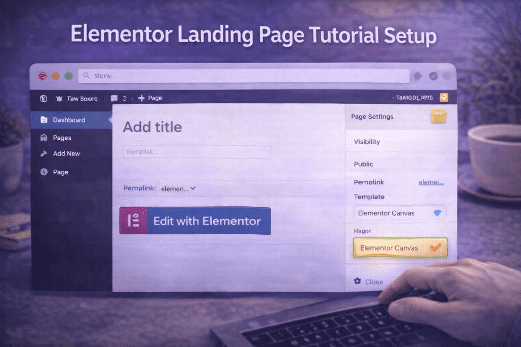
Create the Page in WordPress
Go to WordPress Dashboard → Pages → Add New. Give the page a working title (e.g., “Free Consultation Landing Page” or “Email Signup — Lead Magnet”). In the Page Attributes panel, set the Template to Elementor Canvas. The Canvas template renders the page with no theme header, footer, or sidebar — a completely blank canvas. This is the recommended starting point for every Elementor landing page tutorial build because it eliminates navigation distractions automatically.
Set the permalink slug to your final intended URL before publishing — changing it after publishing breaks any links already pointing to the page. Then click Edit with Elementor to open the editor.
Template Library vs. Building From Scratch
Inside the Elementor editor, you have two approaches to this Elementor landing page tutorial build:
Use a template from Elementor’s library — Click the folder icon in the top panel to open the Template Library. Filter by “Landing Pages” and browse the available designs. When selecting a template for your Elementor landing page tutorial project, prioritize structural completeness over visual style — choose a template that already includes the sections you need (hero, benefits, testimonials, form). Every element is fully editable once inserted: replace text, swap images, adjust colors, and reconfigure the form to match your brand.
Build from scratch — Add a new Container (Flexbox, recommended) or Section for each page section and build top to bottom. The advantage is complete structural control. Build the full skeleton first — all sections with placeholder content — then design each section in a second pass. This is the more disciplined approach for an experienced Elementor landing page tutorial practitioner.
Step 2: Configure a Distraction-Free Canvas
A core principle of every effective Elementor landing page tutorial is removing anything that gives visitors a reason to leave before converting. Navigation menus are the most damaging distraction on a landing page. Every link in a site header gives visitors an alternative to clicking your CTA button — and the more alternatives you give them, the lower your conversion rate will be.
Remove Navigation with Elementor Canvas
If you selected the Elementor Canvas template in Step 1, the theme header and footer are already removed — the page renders with no navigation menu, no sidebar, and no footer links. This is the fastest and most reliable method in this Elementor landing page tutorial for producing a distraction-free layout without needing Elementor Pro.
Create a Minimal Header with Elementor Pro Theme Builder
If you want a logo visible at the top of the page for brand reassurance — without a full navigation menu — use Elementor Pro’s Theme Builder. Go to Elementor → Theme Builder → Header → Add New, create a minimal header with only your site logo, and set its Display Conditions to apply only to pages tagged as landing pages. This gives visitors the trust signal of a visible logo without navigation links pulling them away from the conversion.
Set Global Colors and Fonts Before Building
Before adding any section content, establish your global design foundation. In the Elementor editor, go to Hamburger Menu → Site Settings → Global Colors and define your primary brand color, secondary color, and text color. Then go to Site Settings → Global Fonts and set your Heading font and Body font.
Setting these globals before building any section means every widget you add automatically uses your brand colors and fonts. For landing pages, limit to two font families maximum — one for headings, one for body. More than two font families weakens visual hierarchy and slows page rendering, working against the speed goals of any good Elementor landing page tutorial.
Step 3: Build a High-Converting Hero Section
The hero section is the highest-stakes part of any Elementor landing page tutorial build — it is the first thing every visitor sees, and it determines within three seconds whether they stay or leave. The hero’s job is to communicate your value proposition clearly enough that the right visitor immediately understands what you offer, who it is for, and what they should do next.
Hero Section Structure in Elementor
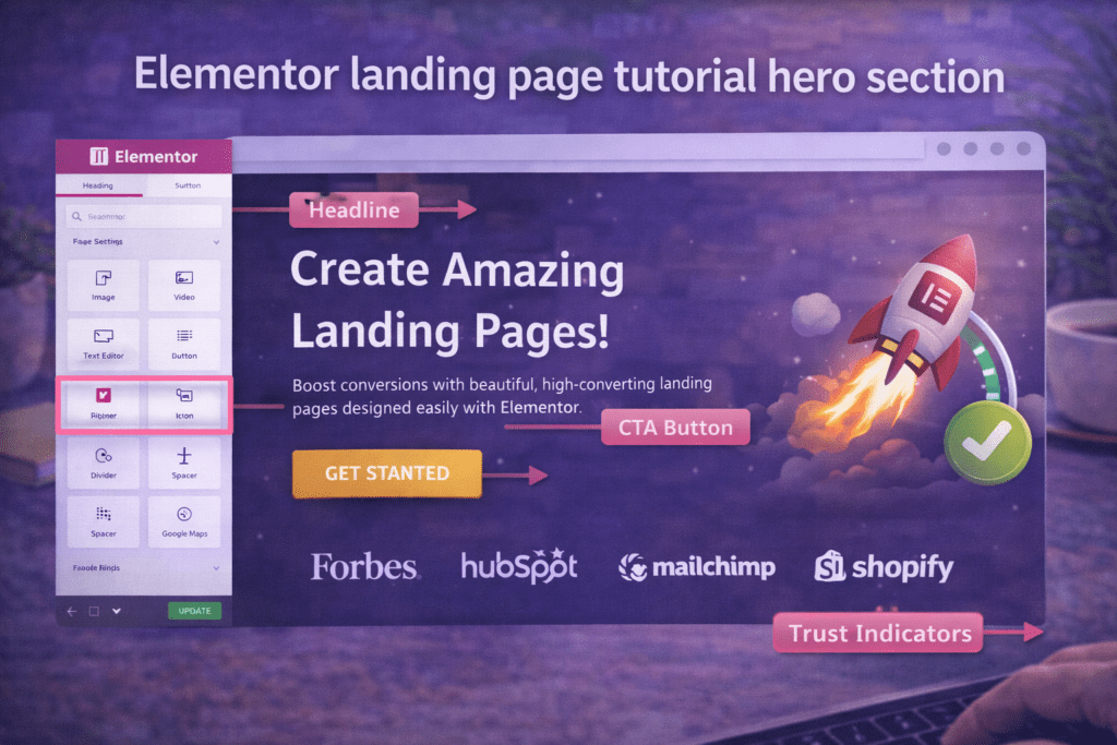
Add a new Container to the top of your canvas. In the Container’s Layout settings, set the minimum height to 100vh so the hero fills the full screen above the fold on any device. In the Style tab, set a background: a solid brand color, a gradient, or a high-quality background image. If using a background image, add a dark Background Overlay to keep text readable.
Inside the hero container, build these elements in order:
Pre-headline — A short qualifying label identifying who the page is for. Example: “For Freelancers and Agencies.” Use the Heading widget at H3 or a small uppercase Text widget, six words or fewer.
Main headline (H1) — Your primary value proposition in one or two lines. There should be exactly one H1 on the page, and it belongs here. Make it specific and benefit-focused: “Get More Clients Without Cold Outreach” outperforms “Welcome to Our Agency” in every test. This is the most important copy decision in this Elementor landing page tutorial.
Sub-headline — One to three sentences expanding on the headline, clarifying who the offer is for and what the visitor specifically receives. Stay under 50 words — brevity above the fold increases reading completion rates.
Primary CTA button — A single prominent button using the Button widget. Write action-oriented text that describes what happens on click: “Start My Free Trial,” “Download the Free Guide,” “Book My Strategy Call.” Never use “Submit” or “Click Here.” Style the button in your primary brand color with generous padding (minimum 16px top/bottom, 32px left/right) and a font size of 16–18px.
Trust indicator — A single line of micro-social proof directly below the button: “Trusted by 4,200+ freelancers” or “No credit card required. Cancel anytime.” This is one of the highest-impact small additions in any Elementor landing page tutorial — it reduces conversion anxiety at the exact moment a visitor is deciding whether to click.
Hero Layout and Responsive Design
Center-aligned hero layouts work best for simple, single-focus offers. Left-aligned layouts with a product screenshot on the right work better for SaaS landing pages where showing the product is part of the value communication. After building the desktop layout, immediately switch to Elementor’s mobile preview and adjust: reduce the H1 font size for mobile (typically 32–40px), set the CTA button to full-width, and confirm the background image crops correctly on portrait screens.
Step 4: Add a Benefits Section That Persuades
After the hero captures attention, the benefits section is the persuasion core of your Elementor landing page tutorial build. It answers the visitor’s immediate question: “What exactly do I get?”
The critical distinction at this stage of the Elementor landing page tutorial is features versus benefits. A feature describes what your product or service does — “AI-powered proposal generation.” A benefit describes what the visitor gets — “Send client proposals in minutes instead of hours.” Lead every benefit item with the visitor’s outcome, then support it with a feature explanation if needed. This reframe transforms a dry product description into compelling persuasion copy.
Building the Icon Box Benefits Grid in Elementor
The most effective benefits layout in this Elementor landing page tutorial is a three-column icon box grid. Add a new Container set to Flex Row with three equal child Containers. Inside each child Container, add an Icon Box widget and configure it with:
An icon from Elementor’s Font Awesome library or a custom SVG, styled in your primary brand color. Use visually distinct icons for each benefit so visitors can scan quickly.
A benefit headline of three to five words written as an outcome: “Save 5 Hours Per Week,” “Never Miss a Deadline,” “Get Paid Faster.” Headlines are the scannability layer — many visitors read only the icon and headline before deciding whether to continue reading.
A supporting description of two to three sentences explaining the benefit in concrete terms, including at least one specific detail (a number, a timeframe, or a named feature) that makes the benefit feel real rather than generic.
For mobile, set the parent Container to switch to Flex Column on mobile breakpoints so the three columns stack vertically into a clean single-column layout.
How Many Benefits to Include
For most landing pages in this Elementor landing page tutorial, three to six benefits is optimal. Fewer than three feels insufficiently persuasive. More than six overwhelms visitors and dilutes the impact of each benefit. If you have more than six genuine benefits, group related ones under a single benefit headline rather than listing every feature individually.
Step 5: Build a Social Proof Section
Social proof is the single most powerful conversion element you can add to a landing page, and no Elementor landing page tutorial is complete without it. Visitors arrive skeptical — they have seen promises before that did not deliver. Testimonials, case study results, star ratings, and user counts provide the external validation that moves skeptical visitors toward conversion in a way that your own copy cannot.
Testimonial Section Layout in Elementor
Add a new Container with a visually distinct background — a light gray, a soft brand color tint, or a dark section — to separate the social proof block from the sections above and below. Inside it, add a section headline: “What Our Customers Are Saying” or “Real Results from Real Users.”
Elementor includes a Testimonial widget (free) and a Testimonial Carousel widget (Pro). For three to five testimonials, a three-column testimonial grid is the cleanest layout. For five or more testimonials, use the Testimonial Carousel with autoplay disabled — autoplay carousels reduce trust by preventing visitors from reading at their own pace.
Each testimonial should include a full name and company (“Sarah K., Freelance Designer”), a real headshot photo (testimonials with photos convert significantly better than text-only), and a specific outcome-focused quote. “I booked 3 new clients in my first two weeks” converts better than “Great service, highly recommend.” Specificity is what makes testimonials believable — and belief is what drives conversions in this Elementor landing page tutorial context.
Trust Badges and Quantified Social Proof
Below the testimonials, add quantified trust signals using Elementor’s Counter widget: “4,200+ Active Users,” “98% Customer Satisfaction,” “12,000+ Projects Completed.” Use specific numbers rather than rounded estimates — “4,237 users” reads as more authentic than “4,000+ users.”
If your business has been featured in media publications, add an “As Seen In” logo row using the Image widget in a flex row container. Media logos — even niche publications — add significant credibility because they represent third-party validation that visitors cannot dismiss as self-promotion.
Step 6: Add a Lead Capture Form or CTA Section
The lead capture section is the conversion point of your entire Elementor landing page tutorial build. Every section above it — the hero, the benefits, the social proof — has been building the visitor’s motivation and trust to the point where they are ready to act. This is where that preparation pays off, and where the Elementor landing page tutorial structure produces measurable results.
Lead Capture Form with Elementor Pro
Elementor Pro’s Form widget is the most integrated way to add lead capture to a landing page. It connects natively with Mailchimp, ActiveCampaign, ConvertKit, HubSpot, GetResponse, and other major platforms without any additional plugin. Add the Form widget to a new Container, then configure it:
Fields — Keep the form as short as possible. Every additional field reduces conversion rate. For a lead magnet or email optin, two fields — First Name and Email Address — is optimal. For a consultation booking form, three to four fields is acceptable. For a product purchase, use a dedicated checkout solution rather than the Form widget.
Actions After Submit — Configure two actions: (1) connect the form to your email marketing platform via the built-in integration (Actions After Submit → Add Action → select your platform → authenticate with API key → map form fields to list fields), and (2) add a Redirect action that sends the visitor to a dedicated thank-you page. That thank-you page URL is what you will use for conversion tracking in Step 9.
Submit button — Style the submit button to match your hero CTA button exactly: same color, same font size, same padding. Use the same action-oriented text: “Send Me the Free Guide,” “Start My Trial,” “Book My Call.” Consistency between CTAs reinforces the conversion path throughout the Elementor landing page tutorial build.
CTA Section Without a Form
If your landing page drives visitors to a purchase page, booking calendar, or external checkout, build a high-contrast CTA section instead. A full-width container with your primary brand color as the background, a strong closing headline, and a single large CTA button signals clearly that this is the action point of the page. Make it visually unmissable.

Step 7: Handle Objections with a FAQ Section
Every visitor who does not convert has an unanswered question. The FAQ section is your opportunity to identify and answer the most common objections before they stop a conversion — and it is a step that most Elementor landing page builds skip entirely. In this Elementor landing page tutorial, the FAQ section belongs between the lead capture form and the final CTA, positioned to convert visitors who read all the way through but still have hesitations.
Building the FAQ with Elementor’s Toggle Widget
Use the Toggle widget or the Accordion widget for FAQ content. Both present questions in a compact, collapsible format. The Toggle widget is preferable for landing pages because it allows multiple items to be open simultaneously — visitors can compare answers across several questions without losing context.
Add a section headline: “Frequently Asked Questions” or “Everything You Need to Know Before Getting Started.” Then build your FAQ items with the question as the toggle label and the full answer as the expanded content.
What Questions to Address in Your Elementor Landing Page Tutorial FAQ
The most effective FAQ content for a landing page comes from real objections your existing customers raised before converting. Organize questions into these categories:
Pricing and commitment: “Is there a free trial?” “What does it cost after the trial?” “Can I cancel at any time?” “Is there a contract?”
Fit and eligibility: “Is this right for my industry?” “Do I need technical skills to get started?” “Does this work for small businesses?”
Trust and support: “How long have you been in business?” “What support do you offer?” “Do you offer a money-back guarantee?”
Results and timeline: “How quickly will I see results?” “What if it doesn’t work for me?”
Five to eight FAQ items is optimal for a landing page following this Elementor landing page tutorial. Place a final CTA button directly after the FAQ — visitors who read through the objection-handling FAQ are among the most motivated on the page and should be immediately offered the action.
Step 8: Optimize for Speed and Mobile
A landing page that loads slowly loses conversions before visitors read the first word — and a broken mobile layout destroys conversions from the majority of your traffic. Speed and mobile optimization are non-negotiable steps in this Elementor landing page tutorial before any page goes live.
Elementor Performance Settings
Go to Elementor → Settings → Performance and enable all three core settings:
Improved Asset Loading — Switches Elementor from loading all widget CSS globally to loading only the styles for widgets used on this specific page. This reduces per-page CSS weight by 30–60% on a typical Elementor landing page tutorial build. After enabling, go to Elementor → Tools → General and click Regenerate CSS & Data.
Inline Font Icons — Eliminates the global Font Awesome CSS request on pages using inline SVG icons, removing a render-blocking resource.
Optimized DOM Output — Reduces the number of HTML wrapper elements per widget, producing a lighter DOM the browser parses and renders faster.
Hero Image Optimization for LCP
The hero background image is almost always the Largest Contentful Paint (LCP) element on a landing page — the metric Google uses to assess how quickly the page’s main content loads. An unoptimized hero image directly tanks both your LCP score and your conversion rate.
Compress the hero image to WebP format using Imagify, ShortPixel, or Smush Pro. Ensure it is served no wider than 1920px. Set the image loading to Eager (never Lazy) in the background image settings. According to Google’s Core Web Vitals documentation, a good LCP score is under 2.5 seconds — an unoptimized hero image is the single fastest path to failing this threshold on an Elementor landing page.
Mobile Responsiveness Review
Use Elementor’s responsive toolbar to review every section on mobile and tablet. In any complete Elementor landing page tutorial, mobile adjustments are always required. Pay attention to:
- Hero H1 font size — Reduce from the desktop size to 32–40px on mobile using Elementor’s responsive font size controls.
- CTA button width — Set to 100% width on mobile so the button is easy to tap with a thumb.
- Column layouts — The three-column benefits grid and testimonial grid must collapse to a single column on mobile. Confirm Flex Direction is set to Column on mobile breakpoints.
- Form field tap targets — Input fields need a minimum height of 48px on mobile for comfortable tapping without zoom.
Step 9: Publish, Test, and Set Up Conversion Tracking
The final step in this Elementor landing page tutorial is a structured pre-publish test followed by conversion tracking setup. Publishing without testing is how conversion-damaging errors — broken forms, misaligned mobile sections, incorrectly linked CTA buttons — reach real visitors. Never skip this step regardless of how confident you are in the build.
Pre-Publish Testing Protocol
Form submission test — Submit a test entry through every form on the page using a real email address. Confirm the submission appears in your email marketing platform, the confirmation email is delivered, and the thank-you redirect URL loads correctly. A broken form silently destroys every conversion on the page — it is the most critical test in this Elementor landing page tutorial.
CTA button test — Click every CTA button on the page and confirm each one navigates to the correct destination. Incorrectly linked buttons are surprisingly common on newly published landing pages.
Cross-device test — Test on a real mobile phone, not just Elementor’s responsive preview. Real-device testing catches rendering issues that the editor preview misses.
Page speed test — Run the page through Google PageSpeed Insights before publishing. Target a mobile score of 70 or above before sending any traffic, especially paid traffic where slow load times directly increase cost per conversion.
Publish and Configure Conversion Tracking
When all tests pass, click Publish in the Elementor editor. In Google Analytics 4, set up a conversion event triggered by a page_view on your thank-you page URL. Go to Admin → Events → Create Event and set the trigger condition to page_view where page_location contains your thank-you page slug. Mark it as a conversion in Admin → Conversions.
Without conversion tracking from day one, you have no data on whether the Elementor landing page tutorial build is working, no ability to run A/B tests, and no baseline for future improvements. Conversion tracking is what transforms a landing page from a guess into a measurable, optimizable growth asset.

Common Elementor Landing Page Mistakes to Avoid
These are the errors that most frequently undermine the results of an Elementor landing page tutorial build — and the corrections that immediately improve conversion performance.
1. Leaving the navigation menu on the page. Navigation links are exit doors. Every link in a header menu is an opportunity for a visitor to leave before converting. The Elementor Canvas template removes this problem automatically. If your current setup shows a full navigation on your landing page, switch the page template to Canvas or create a logo-only header using the Elementor Pro Theme Builder immediately.
2. Using multiple competing CTAs. A landing page asking visitors to “Start a Free Trial,” “Book a Demo,” and “Download the Guide” simultaneously is three landing pages that cannot decide what they want to be. Choose one primary conversion action and build the entire page around it. Multiple CTAs split visitor attention and reduce the conversion rate of every individual action — this is a foundational principle of the Elementor landing page tutorial framework.
3. Writing feature-focused copy instead of benefit-focused copy. Features describe what your product does. Benefits describe what the visitor gets. “AI-powered CRM” is a feature. “Spend less time on admin and more time earning” is a benefit. Every headline, benefit box, and CTA in your Elementor landing page tutorial build should answer the visitor’s question: “What does this mean for me?”
4. Lazy loading the hero image. The hero background image is almost always the LCP element on a landing page. Applying lazy loading to it defers its load, which directly damages the LCP Core Web Vitals score and increases visitor abandonment before the page is visible. Set the hero image loading to Eager — never Lazy.
5. Using a heavy theme alongside Elementor. Running Elementor with a multipurpose theme that includes its own icon library, Google Fonts, animation engine, and page builder styles doubles the page’s asset weight without adding design value. This is one of the most common causes of slow landing pages. Switch to Hello Elementor, Astra, GeneratePress, or Kadence to eliminate theme-level bloat.
6. Not testing the form before publishing. A form that looks correct in the Elementor editor can fail silently in production — an expired API key, an incorrect list ID, or a misconfigured form action can each cause every submission to fail without any visible error. Test the form by submitting a real entry before going live, and test it again after every plugin update.
7. Building desktop-first and reviewing mobile only at the end. Most landing page traffic is mobile. A page that looks perfect on desktop but has illegible text, overlapping elements, and untappable buttons on mobile is failing the majority of its visitors. In this Elementor landing page tutorial, switch to mobile preview after completing each section — not just once at the very end of the build.
8. Publishing without conversion tracking. A landing page without conversion tracking is a blind investment. You cannot determine whether the headline is working, which traffic source converts best, or whether changes improve or hurt performance without data. Configure GA4 conversion events on the thank-you page URL before sending a single visitor to any page built following this Elementor landing page tutorial.
Elementor Landing Page Tutorial Checklist
- ☐ New WordPress page created with Elementor Canvas template selected
- ☐ Permalink slug set to final URL before publishing
- ☐ Global Colors and Global Fonts configured in Elementor Site Settings
- ☐ Lightweight theme active (Hello Elementor, Astra, GeneratePress, or Kadence)
- ☐ Hero section: single H1 headline with specific, benefit-focused value proposition
- ☐ Hero section: sub-headline under 50 words clarifying who the offer is for
- ☐ Hero section: single primary CTA button with action-oriented text
- ☐ Hero section: trust indicator line below the CTA button
- ☐ Hero background image compressed to WebP and loading set to Eager
- ☐ Benefits section: three to six icon boxes with benefit-focused (not feature-focused) headlines
- ☐ Benefits grid: three-column layout collapses to single column on mobile
- ☐ Social proof: testimonials with full names, real photos, and specific result quotes
- ☐ Trust signals: quantified user counts, star ratings, or media logos
- ☐ Lead capture form: minimum fields (name + email for most lead magnets)
- ☐ Form connected to email marketing platform and tested with a real submission
- ☐ Form submit button styled to match hero CTA (same color, text, and size)
- ☐ Thank-you redirect page created and set as form success action
- ☐ FAQ section: five to eight objection-handling questions using Toggle widget
- ☐ Final CTA section: high-contrast background, closing headline, single button
- ☐ Improved Asset Loading enabled and CSS regenerated
- ☐ Full mobile layout reviewed and adjusted at all breakpoints
- ☐ Every CTA button tested and confirmed linking to correct destination
- ☐ Google PageSpeed Insights mobile score 70+ before going live
- ☐ GA4 conversion event configured on thank-you page URL
Frequently Asked Questions
Can I build a landing page with Elementor Free?
Yes — the core layout and design work in this Elementor landing page tutorial can be completed with Elementor Free. The drag-and-drop editor, Container layout, Heading, Text, Button, Icon Box, and Testimonial widgets are all available without a Pro subscription. The main limitation for lead generation landing pages is that Elementor Free does not include the Form widget with email marketing integrations — you will need a separate plugin like WPForms, Fluent Forms, or Mailchimp for WordPress to handle lead capture. Elementor Pro is strongly recommended for any landing page where form-based lead capture is the primary goal.
How do I remove the header and footer from an Elementor landing page?
Set the page template to Elementor Canvas in the WordPress page editor before opening Elementor. The Canvas template renders the page with no theme header, footer, or sidebar — a completely blank canvas. This is the recommended method in this Elementor landing page tutorial for most builds. If you need a minimal header (logo only, no navigation), use Elementor Pro’s Theme Builder to create a custom header and set its display conditions to apply only to the specific landing page.
Does Elementor have landing page templates?
Yes — Elementor’s template library includes hundreds of professionally designed full-page landing page templates covering SaaS, eCommerce, agencies, coaching, events, real estate, and more. In the Elementor editor, click the folder icon to open the Template Library and filter by “Landing Pages.” Elementor Free users can access a portion of the library; Elementor Pro unlocks the full catalog. Every template is fully editable — text, images, colors, layouts, and form configurations can all be customized after inserting the template. Using a template as your starting point is the fastest path through this Elementor landing page tutorial.
How do I connect an Elementor form to Mailchimp or ConvertKit?
With Elementor Pro’s Form widget, go to the Actions After Submit tab in the form settings panel, click “+” to add a new action, and select your email marketing platform from the list. Each integration requires an API key from your email platform — follow the on-screen instructions to authenticate. Once connected, map the form fields to the corresponding fields in your email marketing list. Test by submitting a real entry and confirming the contact appears in your list. This native integration is one of the primary reasons Elementor Pro is recommended for lead generation in this Elementor landing page tutorial.
How many sections should an Elementor landing page have?
A complete landing page following this Elementor landing page tutorial should have seven core sections: Hero, Problem/Pain (optional), Benefits, Social Proof, Lead Capture Form, FAQ, and Final CTA. The right length depends on the complexity of your offer — a simple email optin may need only three or four sections, while a high-ticket service benefits from the full structure. Do not shorten the page to keep it above the fold — visitors scroll, and longer pages with more proof consistently convert better for higher-consideration offers.
What is the fastest way to build an Elementor landing page?
The fastest path through this Elementor landing page tutorial is: select Elementor Canvas, open the Template Library, insert a landing page template matching your offer structure, replace all copy with your actual messaging, swap images for your branded visuals, update Global Colors to your brand palette, connect the form to your email marketing platform, compress and replace the hero image with a WebP version, test the form and all CTA buttons, and publish. Using a template reduces build time from several hours to under 90 minutes for an experienced Elementor user.
How do I track conversions from an Elementor landing page?
The most reliable method from this Elementor landing page tutorial is to create a dedicated thank-you page that visitors are redirected to after form submission, then set up a GA4 conversion event triggered by a page_view on that URL. In Google Analytics 4, go to Admin → Events → Create Event and set the trigger to fire when page_location contains your thank-you page URL. Mark that event as a conversion in Admin → Conversions. This approach captures every successful form submission reliably and provides the data you need to optimize the page over time.